




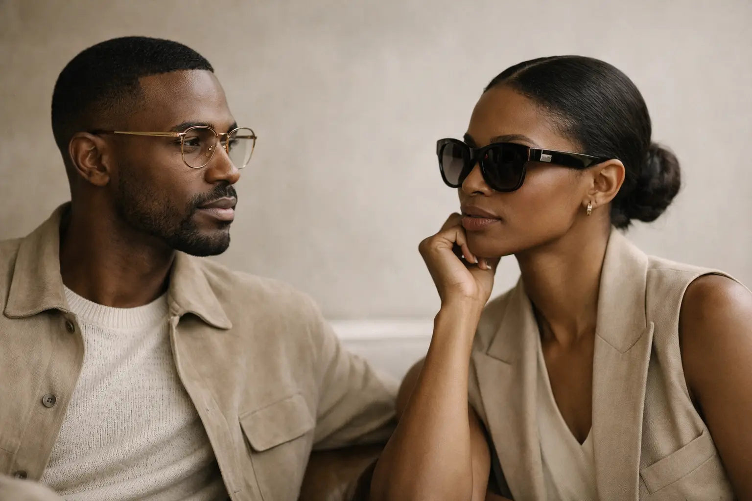
Quiet Luxury vs Logo Eyewear for the Long Term
A frame can announce itself before its wearer has said a word. That is the central distinction in quiet luxury vs logo eyewear: one relies on recognition, while the other earns attention through proportion, material, and the way it settles into a personal uniform.
For the person who wears eyewear from the first meeting to the last reservation, this is not a minor aesthetic choice. Glasses sit at the center of the face. They are seen more often than a watch, a jacket lining, or the leather of a briefcase. The right pair does not need to perform status. It should make the wearer appear more considered.
Quiet Luxury vs Logo Eyewear: Two Different Signals
Logo eyewear uses a recognizable mark, prominent hardware, or unmistakable branding as its primary visual language. There is nothing inherently wrong with that choice. A visible insignia can be playful, archival, or tied to a specific fashion moment. It can also offer instant legibility in rooms where brand fluency is part of the conversation.
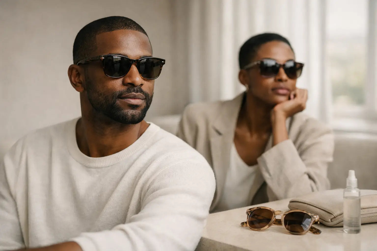
Quiet luxury works differently. It places the emphasis on construction and restraint: a balanced brow line, a well-judged temple thickness, hardware that feels precise rather than decorative, and colors that hold their character in changing light. Its signal is less immediate, but often more durable. Someone may not identify the maker across a room. They may simply register that the frame looks right.
That distinction matters because eyewear is unusually intimate. A loud logo may feel natural for a particular season, vacation, or statement look. A quieter frame has a broader assignment. It needs to work under office lighting, on a screen-filled afternoon, at dinner, and in photographs that will outlive the trend cycle.
Craftsmanship Is the Real Visual Language
The strongest quiet-luxury frames are not anonymous. They are specific in ways that reward a closer look. Material choice is usually where that specificity begins.
Japanese titanium is valued for its exceptional lightness, resilience, and clean architectural possibility. A titanium frame can feel nearly absent on the face while maintaining the structural discipline needed for frequent wear. It suits those who prefer a precise, modern profile and who notice the difference between a frame that merely looks light and one engineered to remain comfortable through a long day.
Italian Mazzucchelli acetate speaks in a different register. Its depth of color, polish, and tactile warmth give a frame visual presence without requiring a logo. A rich tortoise, translucent smoke, or restrained black acetate can reveal layers at the edge and softness in the finish. Over time, well-made acetate develops a relationship with its wearer: it becomes familiar, adjusted, and unmistakably personal.
The details determine whether these materials fulfill their promise. Look for carefully finished edges, stable hinges, aligned temples, and a bridge designed to distribute weight rather than concentrate it. These are functional considerations, but they also affect how a frame reads. Comfort produces composure. A frame that slips, pinches, or needs constant adjustment cannot project ease.
Why Proportion Outlasts Branding
A logo can make a frame recognizable. Proportion makes it memorable.
Consider the width of the front in relation to the face, the depth of the lens, and the line created by the upper rim. A narrow rectangle can sharpen a softer face. A substantial square acetate can lend structure to finer features. A softly rounded optical frame may bring balance to an angular jaw. None of these choices require branding to communicate taste.
This is why quiet luxury is not synonymous with minimalism at all costs. A frame can be sculptural, colored, or substantial and still feel restrained. The question is whether every decision serves the object. Oversized temples, gleaming plaques, and ornamental hardware can be effective when they belong to the design's whole vocabulary. When they exist only to advertise a name, they often date the frame more quickly.
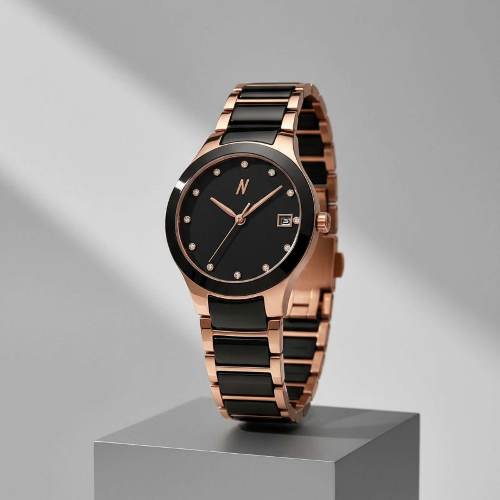
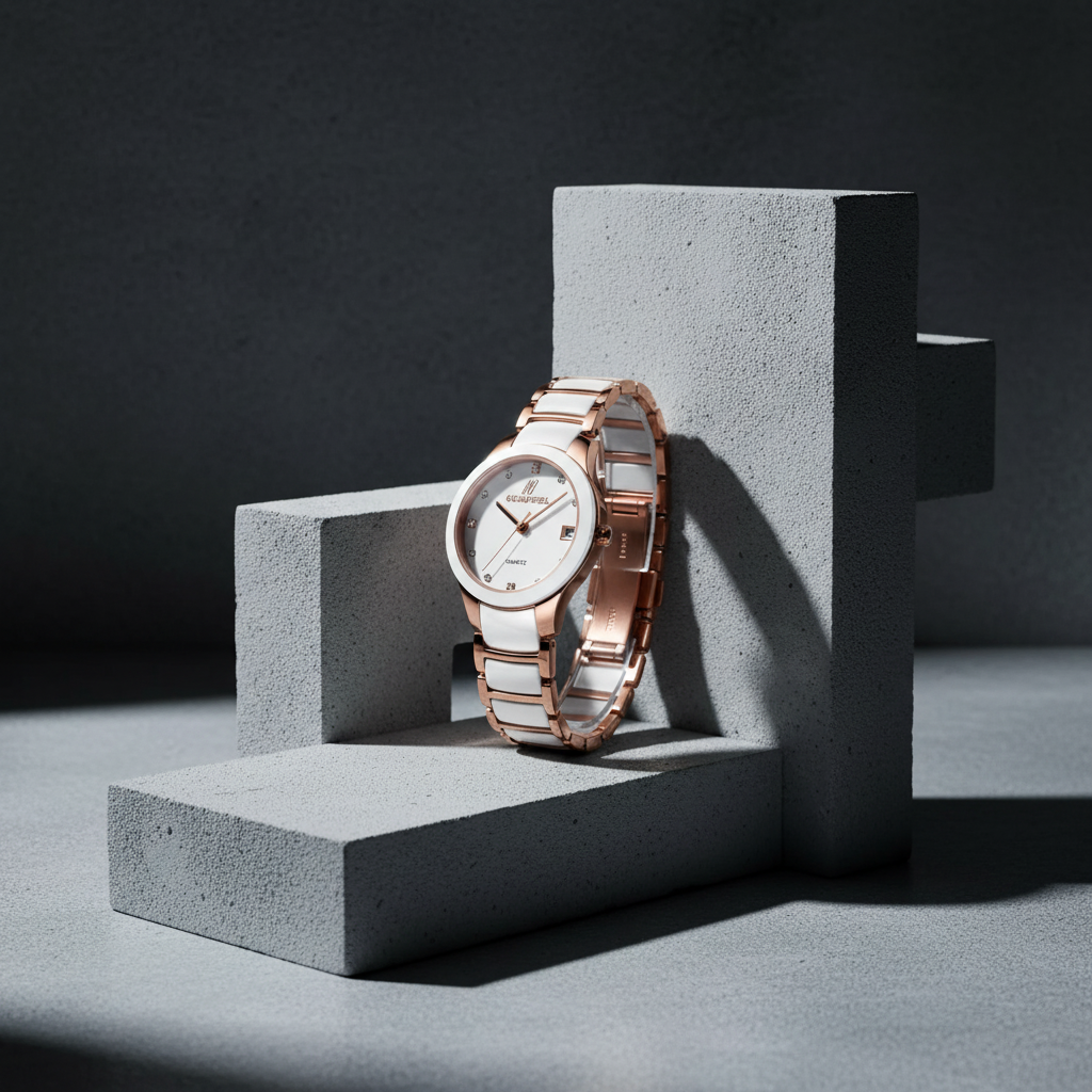
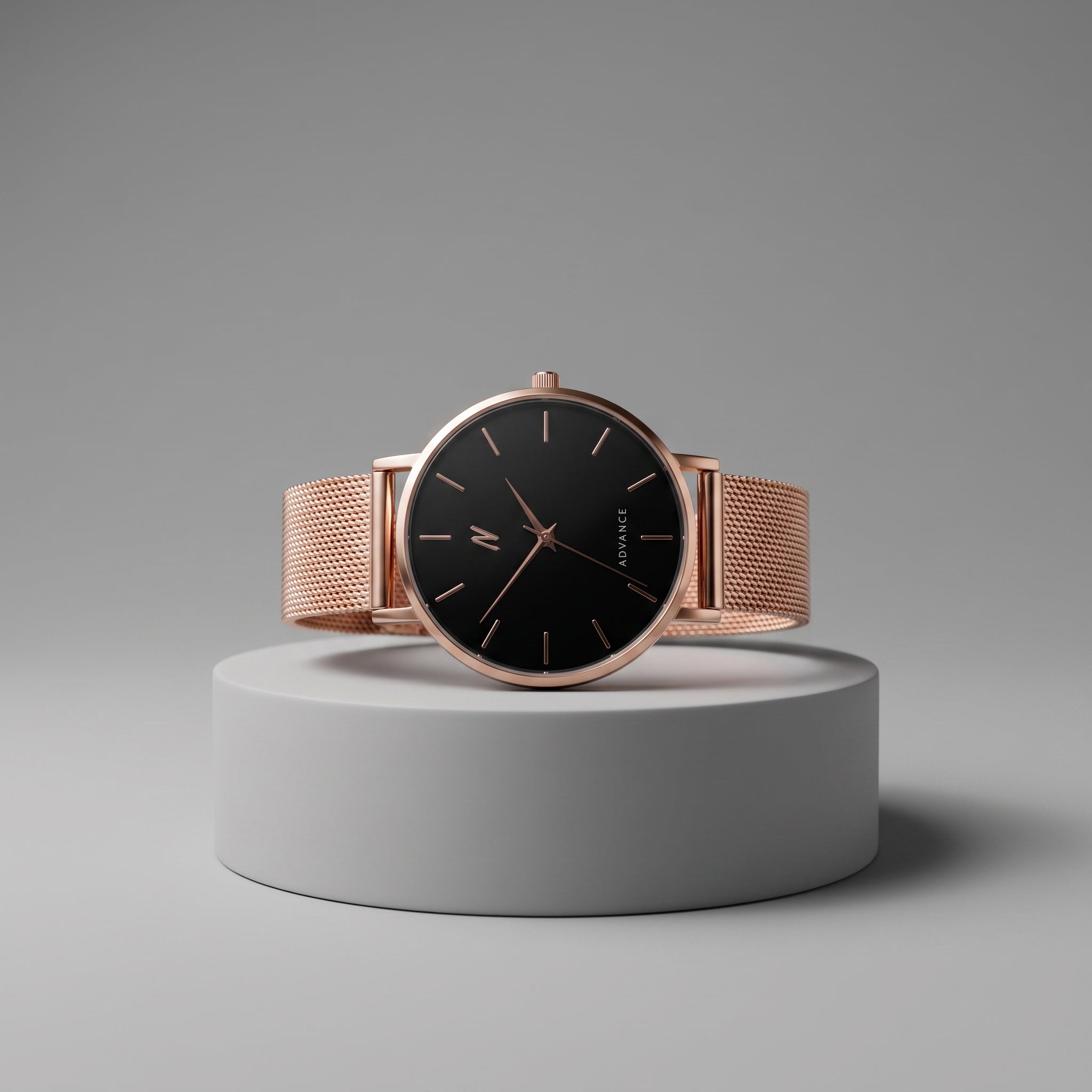
The same principle appears in intentional timepieces. An automatic movement, visible or not, gives a watch its character through mechanical substance. Vegetable-tanned leather gains patina because the material has been allowed to age honestly. In both watches and eyewear, lasting appeal comes from the evidence of considered making rather than surface declaration.
The Case for a Frame You Can Wear Everywhere
For professionals, founders, and creatives, eyewear often has to perform across several identities in one day. It should feel appropriate with tailoring, knitwear, workwear, and evening clothes without becoming visually passive. This is where logo-free or low-logo design has a practical advantage: it leaves room for the wearer.
A refined optical frame can become a signature without becoming a costume. It supports a wardrobe rather than competing with it. The result is not invisibility. It is consistency, the kind that allows colleagues and friends to associate a silhouette with you rather than with a campaign.
Prescription readiness also changes the calculation. When a frame is intended for daily optical use, construction becomes more consequential. Lens weight, bridge comfort, hinge durability, and temple balance are no longer secondary concerns. A well-selected frame should carry prescription lenses with confidence and remain composed after repeated use, travel, and routine adjustment.
FSA/HSA eligibility for qualifying eyewear can make this kind of intentional purchase easier to integrate into the practical realities of annual vision care. The value is not in treating frames as disposable utility. It is in choosing a piece that meets a daily need while holding its visual integrity.
When Logo Eyewear Makes Sense
The quiet-luxury case is not an argument for eliminating all visible branding. Logo eyewear can suit a collector who enjoys fashion history, a person building a more expressive wardrobe, or someone drawn to a specific house code. It can work especially well when the rest of the look is simple and the frame is meant to be the focal point.
The trade-off is versatility. Prominent branding can tie a frame to a particular era, social signal, or outfit mood. That may be precisely the appeal. But if the goal is one frame that can anchor hundreds of ordinary days, a quieter design generally offers more range.
A useful test is to imagine the frame without its mark. Would the shape, material, and finish still deserve attention? If the answer is yes, the design has a foundation. If the logo is doing most of the work, the frame may be better understood as a fashion accent than a long-term staple.
Building a More Intentional Eyewear Rotation
A considered rotation does not require excess. It requires distinction between roles. One frame may be crisp and architectural for workdays. Another may use fuller acetate and softer contours for weekends or travel. Sunglasses can carry more visual weight, while an optical frame remains quieter and closer to the face.
NCMPRBL's Axis and Clarity lines reflect this approach: eyewear organized around a design point of view rather than a passing novelty. The most compelling limited releases are not valuable simply because they are scarce. They matter when a particular color, material treatment, or silhouette adds something enduring to a tightly edited wardrobe.
Care is part of ownership. Store frames in a protective case, rinse away grit before wiping lenses, and have fit checked when temples loosen or the frame begins to sit unevenly. These small habits protect the finish and extend the life of the object. They also preserve the reason to choose better materials in the first place.
Quiet luxury does not ask others to recognize a label. It asks the wearer to recognize quality: the measured line of the frame, the feel of its materials, and the confidence of reaching for it again without needing to reconsider the choice.